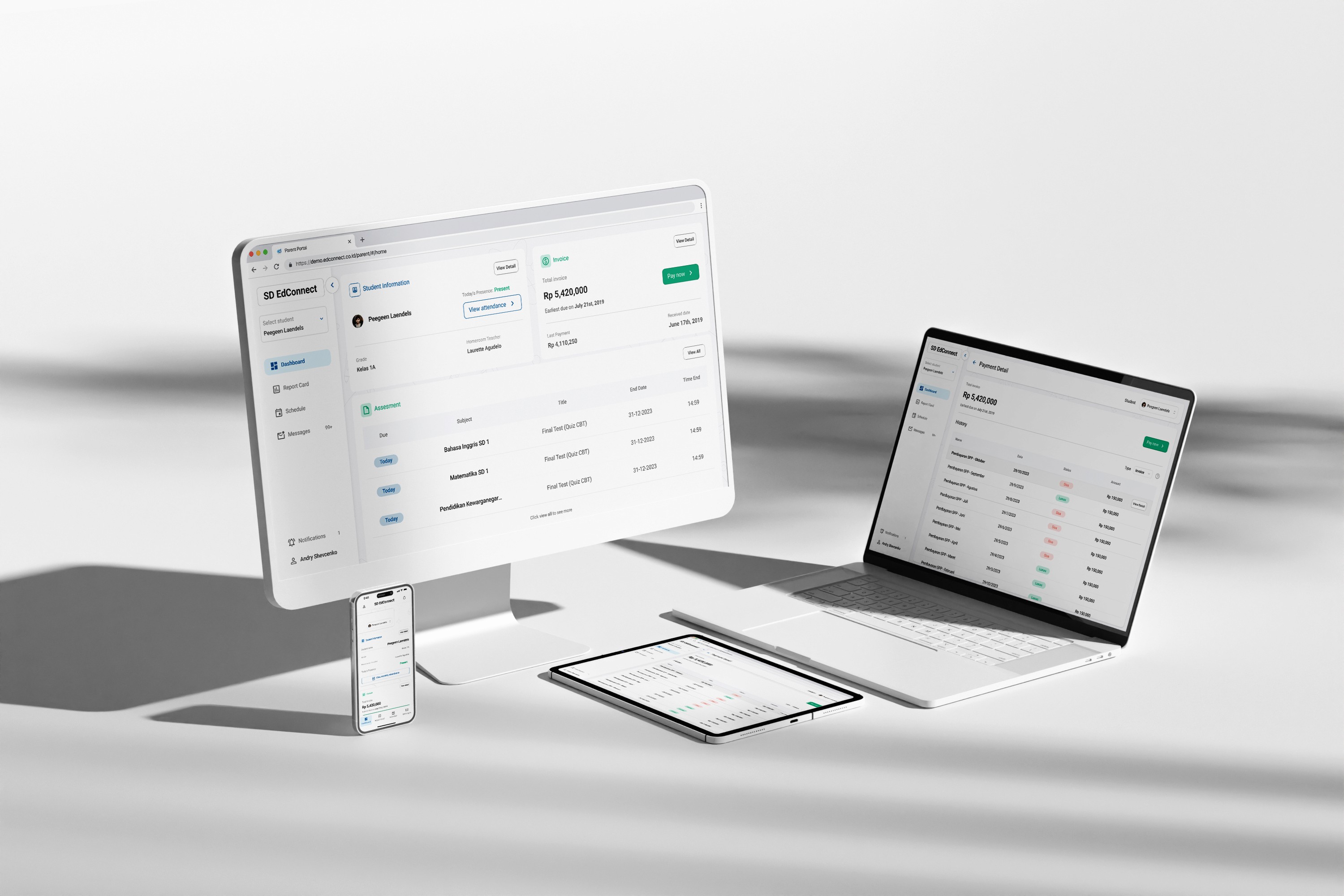


SaaS School Management System: Helping Parents Monitor Children's School Activities
SaaS School Management System: Helping Parents Monitor Children's School Activities
Role:
UX/UI Designer
Duration:
Nov 2023 - Dec 2023 (1 Month)
Responsibilities:
UI Design, Prototype, Design systems
Executive Summary
Currently, Edconnect wants to redesign its parents portal to create a better user expericene for the users but they don’t have a designer. I was tasked to redesign the entire parents portal as well as creating the design system.
Challenge
Redesign the webapp to enchance the user experience without changing user flow and data types being called.
The Heuristic Evaluations
The first thing i did when auditting this website is conducted the heuristic evaluations. The image below is one of the example of heuristic evaluations i did.

The default theme lacks visual appeal as it wasnt crafted by designers.
The inteface of Edconnect webapp still maintains a rather simplistic design. To identify shortcomings in the website's UX, I conducted heuristic evaluations and identified over 15 elements that do not meet the standard.

The absence of change password validaiton flow
On this website, the password change flow lacks user validation. Currently, users can simply navigate to the menu and directly change their password without any validation. This vulnerability exposes user accounts to the risk of having their passwords changed by unauthorized parties without prior validation.

Solutions
Bottom-up appraoch: Create design systems first.
To deliver a good User Experience, it's imperative to craft a polished and consistent User Interface. Achieving consistency in the User Interface entails establishing a unified design language from the outset. My approach involves creating a design system encompassing a color palette, typography, iconography, and interface components.
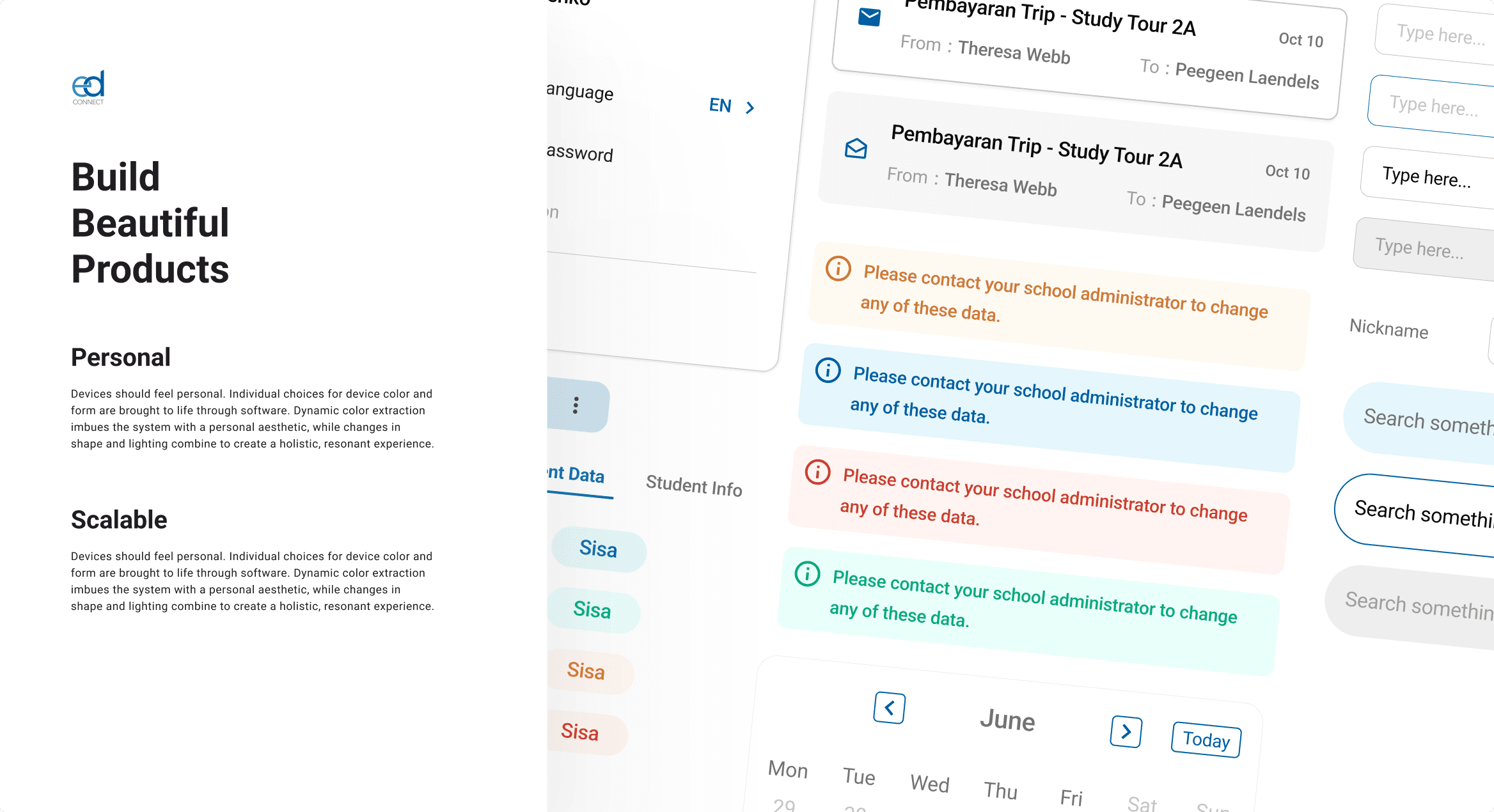
Design System cover. Inspired by Material Design Systems.
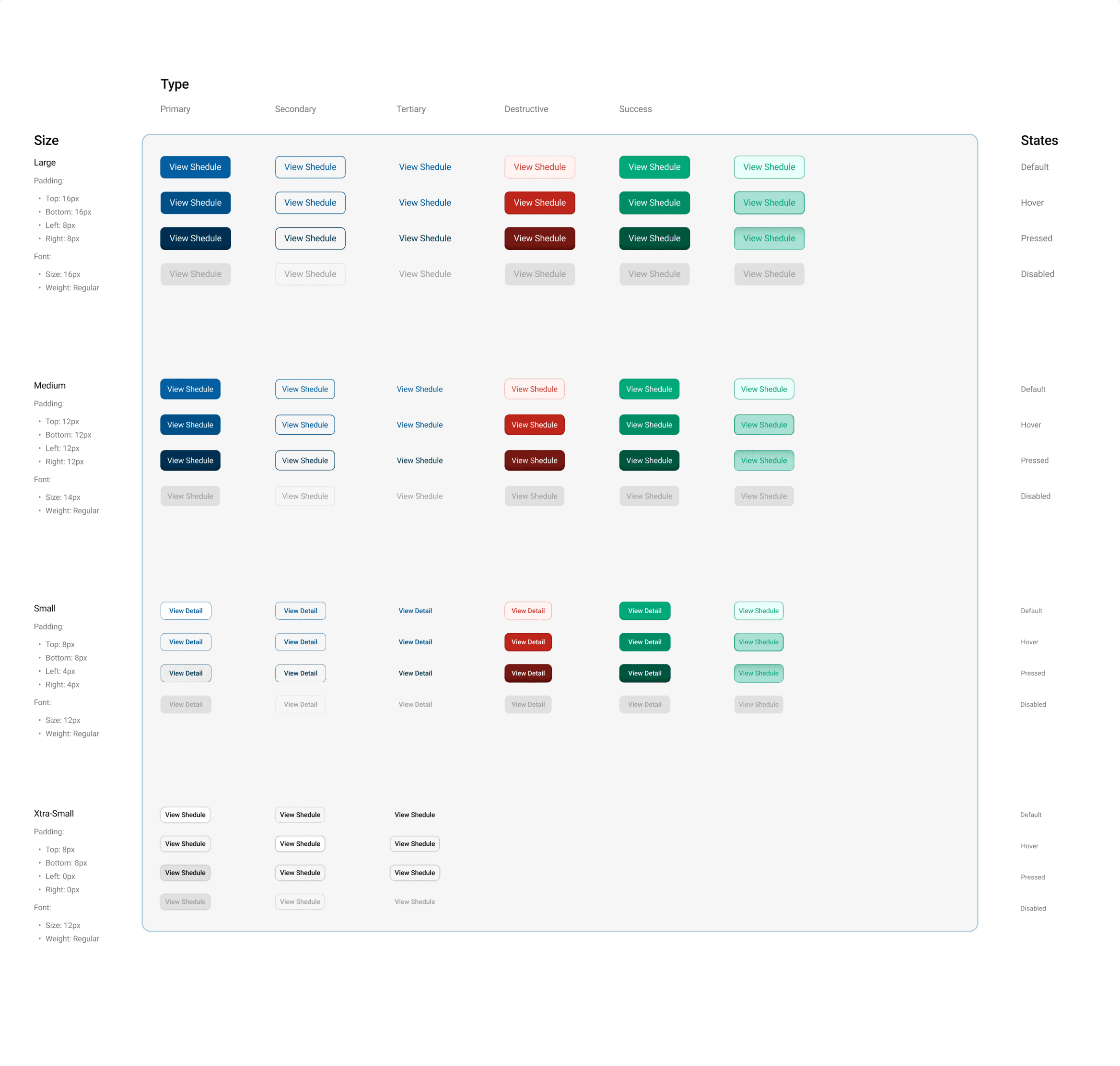
Example of button documentations in the EdConnect design systems made by myself.
Simplify simple actions
For example, on the homepage, when parents want to change the displayed student information, they previously had to click on the hamburger menu, then select "Student name" from the dropdown. Several users complained about the difficulty of finding this menu. Therefore, I simplified this action by making it very clear upfront and removing the hamburger menu altogether.

Create the flow and conduct testing: Change & Forgot Password
Due to their distinct purposes, the password change and forgot password flows are separated. Following usability testing, the results yielded a usability score of 85, reflecting the effectiveness of the design in enhancing user experience.

Inform users about how to conduct payment
In the current interface, there are no instructions or assistance provided on how to pay school bills. EdConnect only provides a Virtual Account (VA) number, which cannot be paid through the web application portal. Thus, users need to make manual payments via mobile banking. To address this issue, I've added a "Payment Instructions" button to facilitate users in understanding the payment process.

Data visualizations:
Inform users about student attendance more clearly
When accessing the student attendance page, parents are presented with a summary of their child's attendance in the form of a pie chart. However, as some users (parents) feel the need for more detailed information regarding their child's attendance. In response to this feedback, I have implemented a calendar displaying the attendance list, addressing their concerns and providing them with the desired level of detail.

Present data tables in more efficient way
I noticed that on the payment page, there is an inefficient data visualization in table form (Fig. 1). There are several problems in the table, the presentation of the table data is inefficient because the data alignment is irregular and there is no signifier that each row of data can be clicked on.
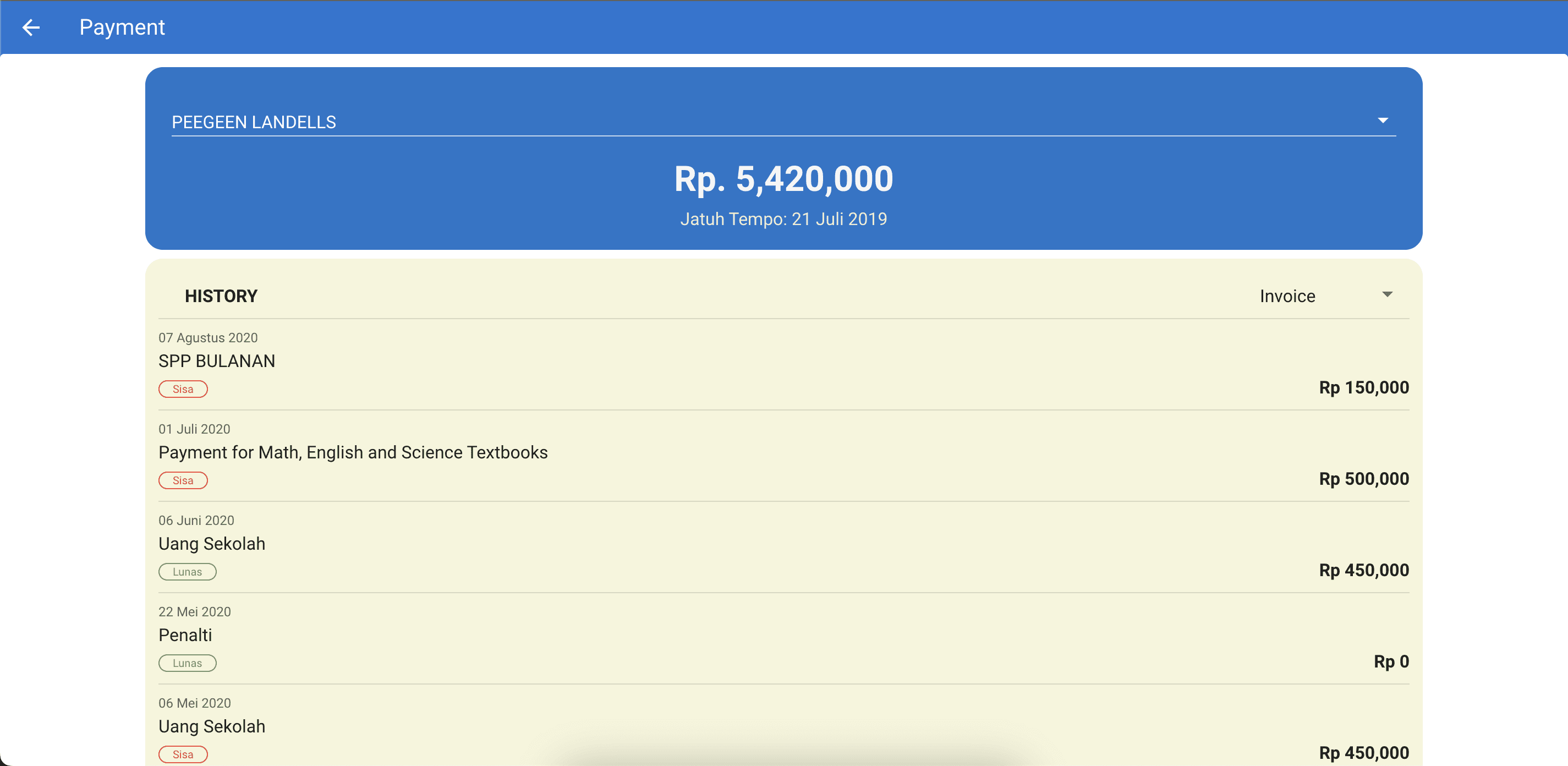
Fig. 1 Current data tables
So I created a solution to change the shape of the data table to be more organized and add a 'view detail' button when the user hovers over the data row.
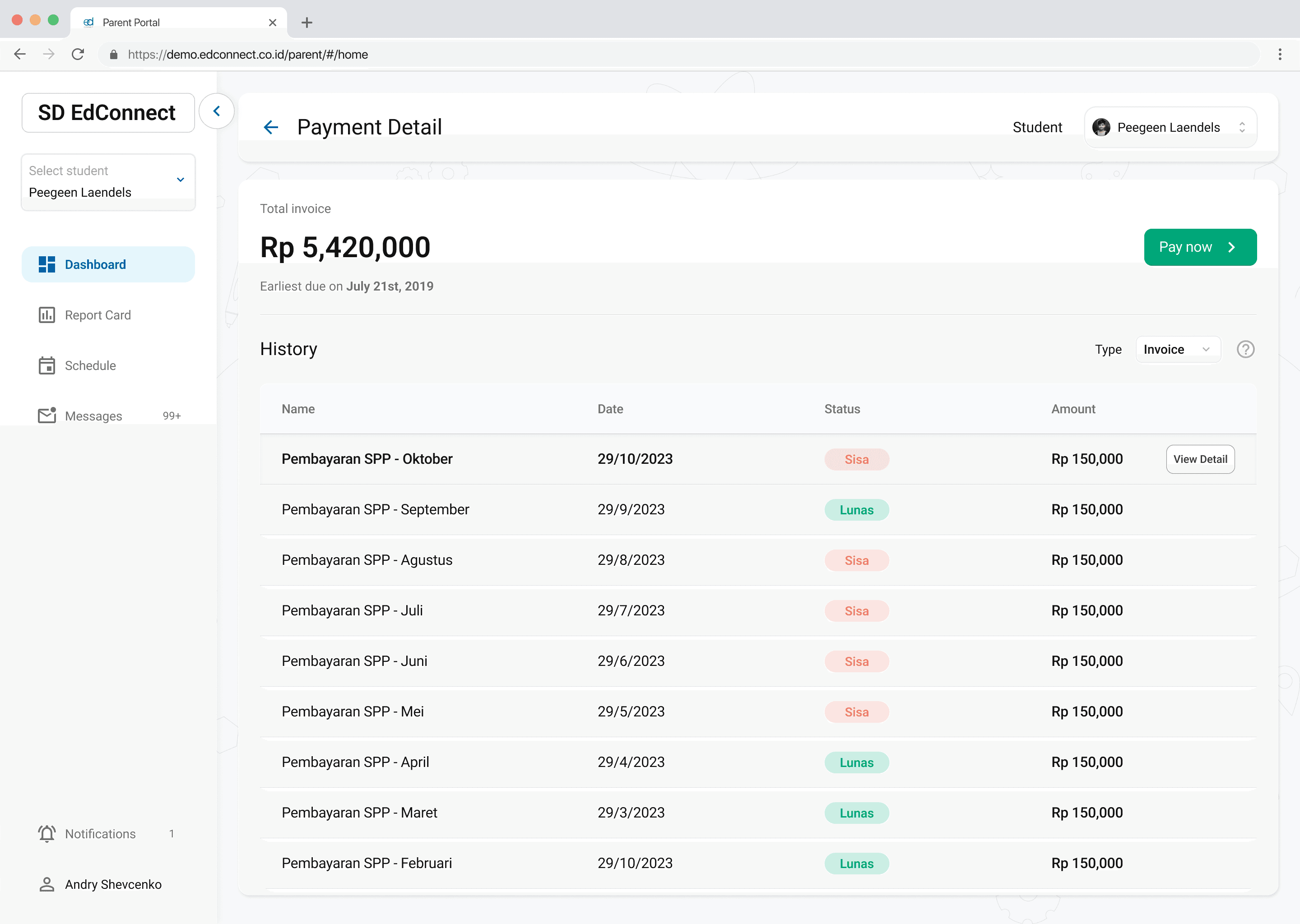
Fig. 2 New redesign data tables
End Result
Desktop Version


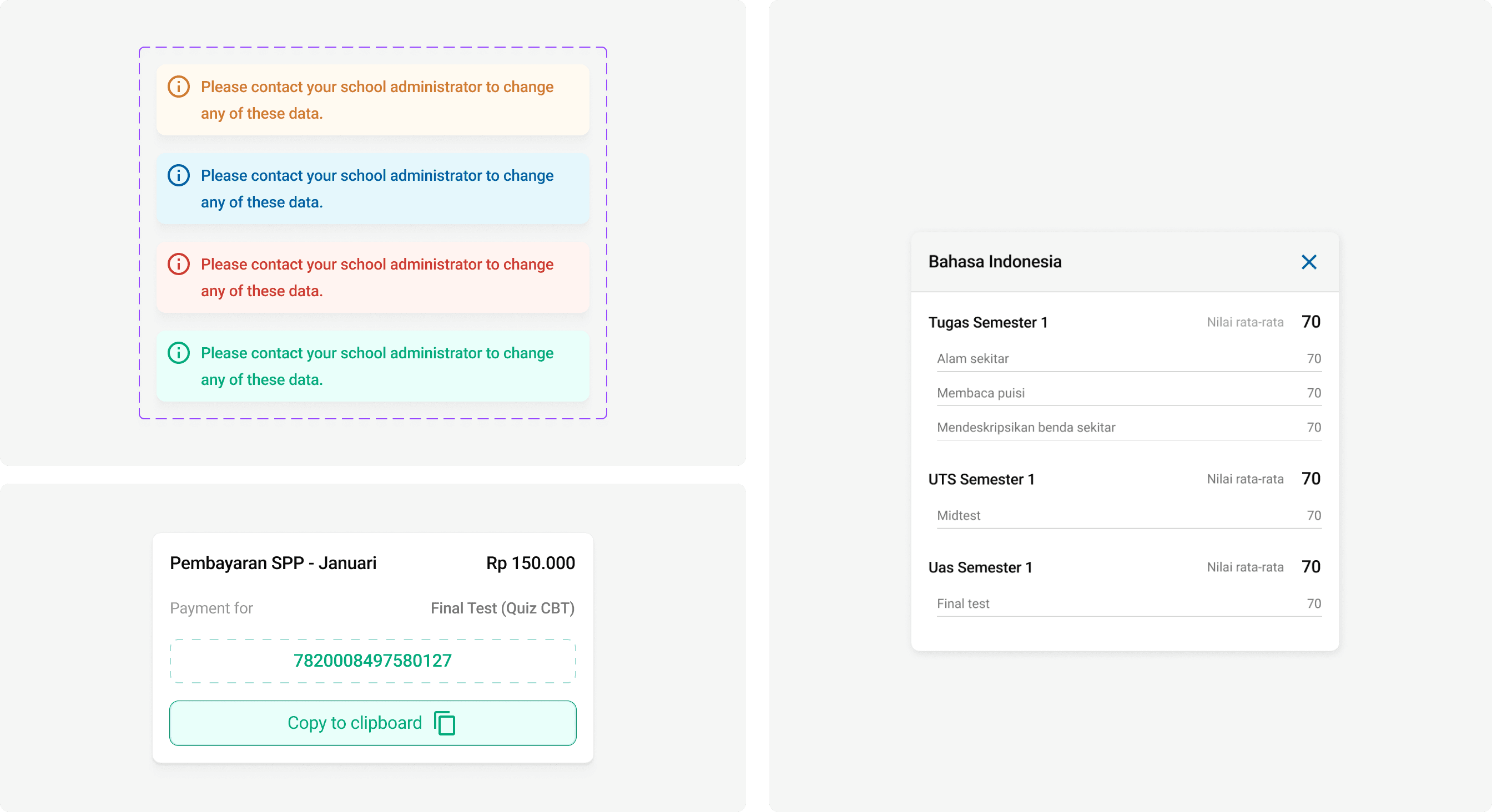
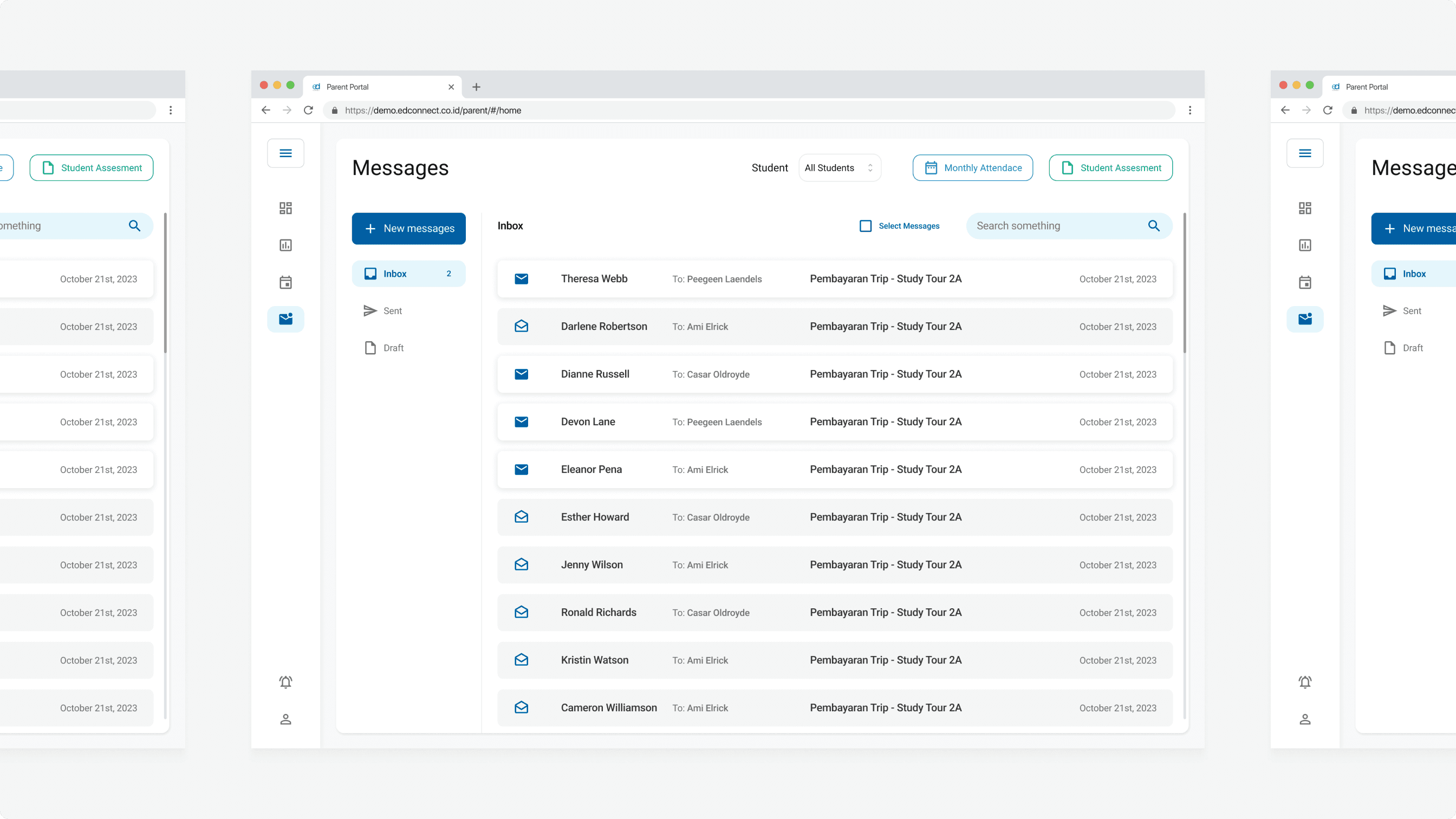
Mobile Version


Executive Summary
Currently, Edconnect wants to redesign its parents portal to create a better user expericene for the users but they don’t have a designer. I was tasked to redesign the entire parents portal as well as creating the design system.
Challenge
Redesign the webapp to enchance the user experience without changing user flow and data types being called.
The Heuristic Evaluations
The first thing i did when auditting this website is conducted the heuristic evaluations. The image below is one of the example of heuristic evaluations i did.

The default theme lacks visual appeal as it wasnt crafted by designers.
The inteface of Edconnect webapp still maintains a rather simplistic design. To identify shortcomings in the website's UX, I conducted heuristic evaluations and identified over 15 elements that do not meet the standard.

The absence of change password validaiton flow
On this website, the password change flow lacks user validation. Currently, users can simply navigate to the menu and directly change their password without any validation. This vulnerability exposes user accounts to the risk of having their passwords changed by unauthorized parties without prior validation.

Solutions
Bottom-up appraoch: Create design systems first.
To deliver a good User Experience, it's imperative to craft a polished and consistent User Interface. Achieving consistency in the User Interface entails establishing a unified design language from the outset. My approach involves creating a design system encompassing a color palette, typography, iconography, and interface components.

Design System cover. Inspired by Material Design Systems.

Example of button documentations in the EdConnect design systems made by myself.
Simplify simple actions
For example, on the homepage, when parents want to change the displayed student information, they previously had to click on the hamburger menu, then select "Student name" from the dropdown. Several users complained about the difficulty of finding this menu. Therefore, I simplified this action by making it very clear upfront and removing the hamburger menu altogether.

Create the flow and conduct testing: Change & Forgot Password
Due to their distinct purposes, the password change and forgot password flows are separated. Following usability testing, the results yielded a usability score of 85, reflecting the effectiveness of the design in enhancing user experience.

Inform users about how to conduct payment
In the current interface, there are no instructions or assistance provided on how to pay school bills. EdConnect only provides a Virtual Account (VA) number, which cannot be paid through the web application portal. Thus, users need to make manual payments via mobile banking. To address this issue, I've added a "Payment Instructions" button to facilitate users in understanding the payment process.

Data visualizations:
Inform users about student attendance more clearly
When accessing the student attendance page, parents are presented with a summary of their child's attendance in the form of a pie chart. However, as some users (parents) feel the need for more detailed information regarding their child's attendance. In response to this feedback, I have implemented a calendar displaying the attendance list, addressing their concerns and providing them with the desired level of detail.

Present data tables in more efficient way
I noticed that on the payment page, there is an inefficient data visualization in table form (Fig. 1). There are several problems in the table, the presentation of the table data is inefficient because the data alignment is irregular and there is no signifier that each row of data can be clicked on.

Fig. 1 Current data tables
So I created a solution to change the shape of the data table to be more organized and add a 'view detail' button when the user hovers over the data row.

Fig. 2 New redesign data tables
End Result
Desktop Version


Mobile Version


Executive Summary
Currently, Edconnect wants to redesign its parents portal to create a better user expericene for the users but they don’t have a designer. I was tasked to redesign the entire parents portal as well as creating the design system.
Challenge
Redesign the webapp to enchance the user experience without changing user flow and data types being called.
The Heuristic Evaluations
The first thing i did when auditting this website is conducted the heuristic evaluations. The image below is one of the example of heuristic evaluations i did.

The default theme lacks visual appeal as it wasnt crafted by designers.
The inteface of Edconnect webapp still maintains a rather simplistic design. To identify shortcomings in the website's UX, I conducted heuristic evaluations and identified over 15 elements that do not meet the standard.

The absence of change password validaiton flow
On this website, the password change flow lacks user validation. Currently, users can simply navigate to the menu and directly change their password without any validation. This vulnerability exposes user accounts to the risk of having their passwords changed by unauthorized parties without prior validation.

Solutions
Bottom-up appraoch: Create design systems first.
To deliver a good User Experience, it's imperative to craft a polished and consistent User Interface. Achieving consistency in the User Interface entails establishing a unified design language from the outset. My approach involves creating a design system encompassing a color palette, typography, iconography, and interface components.

Design System cover. Inspired by Material Design Systems.

Example of button documentations in the EdConnect design systems made by myself.
Simplify simple actions
For example, on the homepage, when parents want to change the displayed student information, they previously had to click on the hamburger menu, then select "Student name" from the dropdown. Several users complained about the difficulty of finding this menu. Therefore, I simplified this action by making it very clear upfront and removing the hamburger menu altogether.

Create the flow and conduct testing: Change & Forgot Password
Due to their distinct purposes, the password change and forgot password flows are separated. Following usability testing, the results yielded a usability score of 85, reflecting the effectiveness of the design in enhancing user experience.

Inform users about how to conduct payment
In the current interface, there are no instructions or assistance provided on how to pay school bills. EdConnect only provides a Virtual Account (VA) number, which cannot be paid through the web application portal. Thus, users need to make manual payments via mobile banking. To address this issue, I've added a "Payment Instructions" button to facilitate users in understanding the payment process.

Data visualizations:
Inform users about student attendance more clearly
When accessing the student attendance page, parents are presented with a summary of their child's attendance in the form of a pie chart. However, as some users (parents) feel the need for more detailed information regarding their child's attendance. In response to this feedback, I have implemented a calendar displaying the attendance list, addressing their concerns and providing them with the desired level of detail.

Present data tables in more efficient way
I noticed that on the payment page, there is an inefficient data visualization in table form (Fig. 1). There are several problems in the table, the presentation of the table data is inefficient because the data alignment is irregular and there is no signifier that each row of data can be clicked on.

Fig. 1 Current data tables
So I created a solution to change the shape of the data table to be more organized and add a 'view detail' button when the user hovers over the data row.

Fig. 2 New redesign data tables
End Result
Desktop Version


Mobile Version


Executive Summary
Currently, Edconnect wants to redesign its parents portal to create a better user expericene for the users but they don’t have a designer. I was tasked to redesign the entire parents portal as well as creating the design system.
Challenge
Redesign the webapp to enchance the user experience without changing user flow and data types being called.
The Heuristic Evaluations
The first thing i did when auditting this website is conducted the heuristic evaluations. The image below is one of the example of heuristic evaluations i did.

The default theme lacks visual appeal as it wasnt crafted by designers.
The inteface of Edconnect webapp still maintains a rather simplistic design. To identify shortcomings in the website's UX, I conducted heuristic evaluations and identified over 15 elements that do not meet the standard.

The absence of change password validaiton flow
On this website, the password change flow lacks user validation. Currently, users can simply navigate to the menu and directly change their password without any validation. This vulnerability exposes user accounts to the risk of having their passwords changed by unauthorized parties without prior validation.

Solutions
Bottom-up appraoch: Create design systems first.
To deliver a good User Experience, it's imperative to craft a polished and consistent User Interface. Achieving consistency in the User Interface entails establishing a unified design language from the outset. My approach involves creating a design system encompassing a color palette, typography, iconography, and interface components.

Design System cover. Inspired by Material Design Systems.

Example of button documentations in the EdConnect design systems made by myself.
Simplify simple actions
For example, on the homepage, when parents want to change the displayed student information, they previously had to click on the hamburger menu, then select "Student name" from the dropdown. Several users complained about the difficulty of finding this menu. Therefore, I simplified this action by making it very clear upfront and removing the hamburger menu altogether.

Create the flow and conduct testing: Change & Forgot Password
Due to their distinct purposes, the password change and forgot password flows are separated. Following usability testing, the results yielded a usability score of 85, reflecting the effectiveness of the design in enhancing user experience.

Inform users about how to conduct payment
In the current interface, there are no instructions or assistance provided on how to pay school bills. EdConnect only provides a Virtual Account (VA) number, which cannot be paid through the web application portal. Thus, users need to make manual payments via mobile banking. To address this issue, I've added a "Payment Instructions" button to facilitate users in understanding the payment process.

Data visualizations:
Inform users about student attendance more clearly
When accessing the student attendance page, parents are presented with a summary of their child's attendance in the form of a pie chart. However, as some users (parents) feel the need for more detailed information regarding their child's attendance. In response to this feedback, I have implemented a calendar displaying the attendance list, addressing their concerns and providing them with the desired level of detail.

Present data tables in more efficient way
I noticed that on the payment page, there is an inefficient data visualization in table form (Fig. 1). There are several problems in the table, the presentation of the table data is inefficient because the data alignment is irregular and there is no signifier that each row of data can be clicked on.

Fig. 1 Current data tables
So I created a solution to change the shape of the data table to be more organized and add a 'view detail' button when the user hovers over the data row.

Fig. 2 New redesign data tables
End Result
Desktop Version


Mobile Version


