

The journey in reducing bounce rate & speed up registrations proccess of an alcoholic beverages E-Commerce
The journey in reducing bounce rate & speed up registrations proccess of an alcoholic beverages E-Commerce
Role:
UX/UI Designer
Duration:
1st week of October 2023 - 3rd week of October 2023 (2 Weeks)
Responsibilities:
UI Design, Usability Testing
Executive summary
We are in the middle of a project to develop an e-commerce design for Birmas. When testing the registration flow design, our test results showed that 30% of users failed to complete the task given with the main reason being too many steps and input fields required. We were tasked to fixed this problem and create new design iteration and successfully reduce the bounce rate to 0% during registration proccess using usability testing methods.
The Background
Problems Explained
Users are assigned to add products to the cart and complete the checkout flow without having an account. Because they are not logged in, when attempting to proceed with the checkout, users will be directed to the registration page. During testing, we encountered the following issues:
3 out of 10 users failed to complete the given task because there were too many steps and input fields to fill
All 3 users who failed to complete the task quitted at the same page during the testing phase, which is filling out the shipping information
Main goal
Reduce the bounce rate during the registration process by creating a more concise flow and focusing on essential things.
The original flow explained
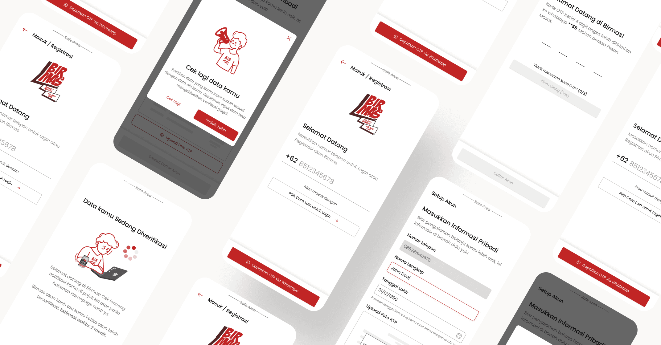
The image below is the registration flow of Birmas. Please note that the login and register page are combined into single page to speed up the proccess.

The proccess will be look like this
User fill in the phone number field
Birmas send OTP to whatsapp number
User input the OTP
User fill out the personal informations and upload valid ID card photo
User is given options to jump straight to checkout flow OR setup the account (fill out shipping informations & product preferences)
User finish register
Birmas will validate user ID
The problems
Breakdown every UI page(s). Found the problems. Iterate.
Couldn’t do google and phone OTP at the same time.
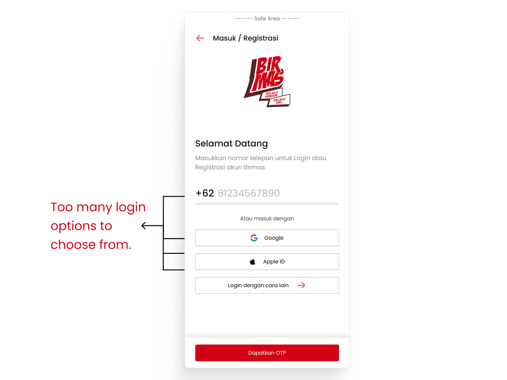

First of all, let’s take a look from business perspective. So initially i wanted to use Google as an alternate option for creating account, but Birmas decided to not using social account (google & apple account) to create account. Therefore i have to take these out. As a result, local phone number will be the main option to access Birmas besides login with email (labeled as 'Login dengan cara lain').
Focus on single log-on access

As we did the testing, we found some interesting insight from a couple of users “i already used my phone, why would you need my email too?”. Yes, but why? here’s the background story.
Because Birmas is a web-based e-commerce, users can access it from both desktops and smartphones. We want to provide an option for users who already have a Birmas account to still be able to make reservations even if they are not currently holding a smartphone. They can log in using the email linked to their account, a process that can be done after users register using a phone number.
But after doing the testing, we decided to take out the email input in this page to speed up the registration proccess. Users can still use this feature later in the setting page after creating account.
Too many input fields

This is where the main problem lies. There are 2 major problems to why users didn’t finish the testing:
Users feel exhausted as there are too many fields needed to be filled in this page. Given that users are still on the early proccess of registrations, this leads to users feel frustrated and quit the proccess.
Moreover, some users didn’t like the province (labeled as provinsi), city (Kota/Kabupaten), and ZIP/Postal code (Kode pos) field need to be entered manually. Some users don’t really know exactly the postal code and need to find online.
Data driven, but turns out to be a wasteful feature.
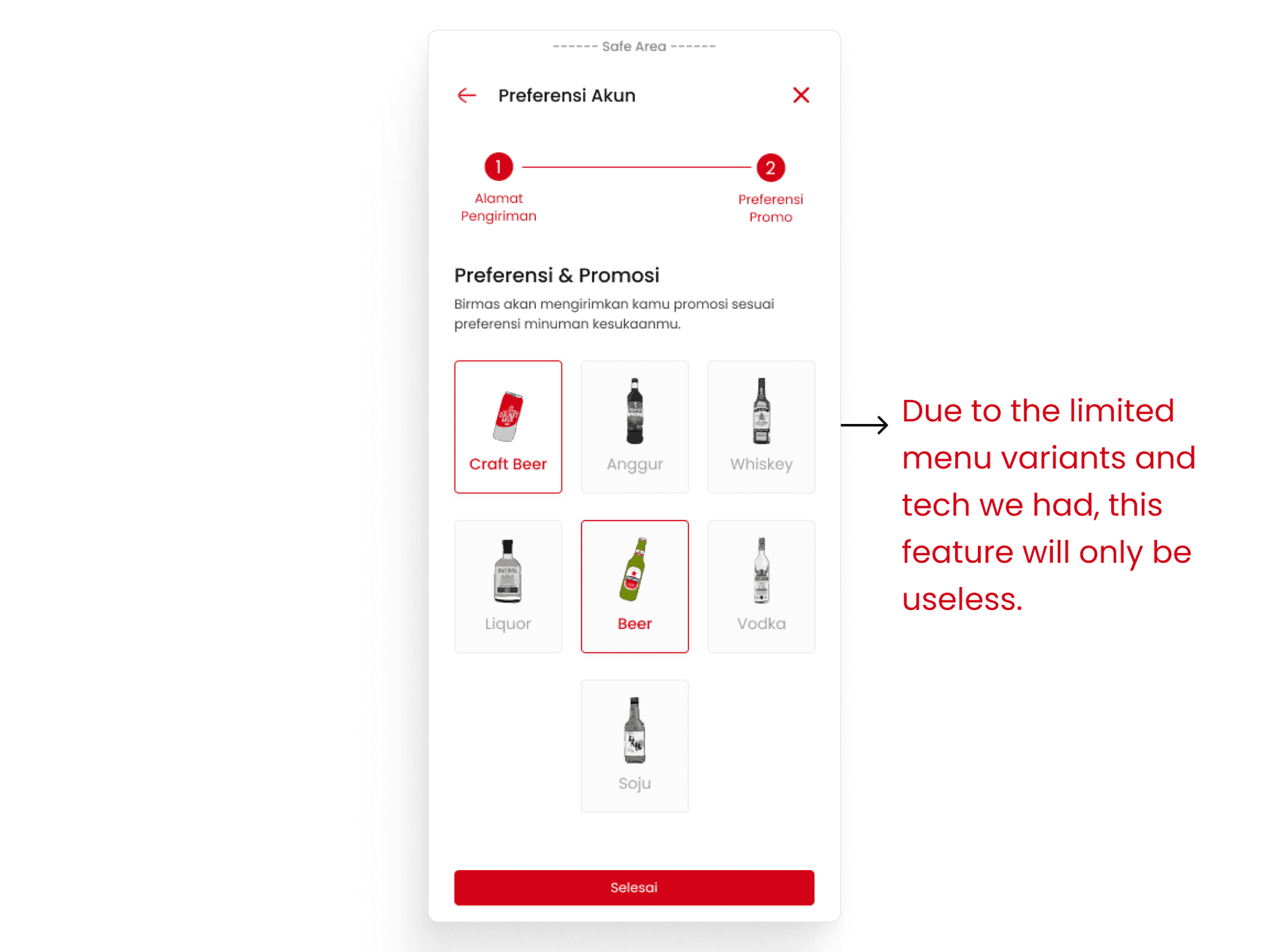
At first, I wanted to create a personalized homepage that would display product recommendations based on user preferences as well as the store’s. However, due to variations in product stock among stores and limitations posed by our small-growing team, it was best to remove this feature and proceed with displaying store recommendations only.
The solutions
Solutions

After carefully discussing the problems with project manager and stakeholders, we decided to create a couple of solutions:
On the register page, we only use phone number to create an account. Users still can use email but this can only be done after creating account on the setting page.
Take out non-essential things, focus on what only matters. We take out the email input, option to fill out shipping informations, and eliminate the promotion page entirely.
I also changed the province, city, and ZIP code to dropdown to help users speed up the proccess.
Added a confirmation modal as error prevention (labeled as 'Cek lagi data kamu', the fourth page) . I figured out later that one of the 10 Heuristic usability rules is that Error Prevention. I wanted to make sure users are conviced or double check their data before finishing registration.
Result
After carefully redesigned the flow and redoing the testing, we were able to:
Reduced the bounce rate to 0%.
Reduce time to finish the task by 32% (that’s a lot!)
I also asked the users about the new flow (since the shipping form is done on later stage), and 9 out of 10 users said they prefer the new flow. They said they rather to fill out shipping informations later and focus to finish registrations and continue their shopping journey.
Executive summary
We are in the middle of a project to develop an e-commerce design for Birmas. When testing the registration flow design, our test results showed that 30% of users failed to complete the task given with the main reason being too many steps and input fields required. We were tasked to fixed this problem and create new design iteration and successfully reduce the bounce rate to 0% during registration proccess using usability testing methods.
The Background
Problems Explained
Users are assigned to add products to the cart and complete the checkout flow without having an account. Because they are not logged in, when attempting to proceed with the checkout, users will be directed to the registration page. During testing, we encountered the following issues:
3 out of 10 users failed to complete the given task because there were too many steps and input fields to fill
All 3 users who failed to complete the task quitted at the same page during the testing phase, which is filling out the shipping information
Main goal
Reduce the bounce rate during the registration process by creating a more concise flow and focusing on essential things.
The original flow explained
The image below is the registration flow of Birmas. Please note that the login and register page are combined into single page to speed up the proccess.

The proccess will be look like this
User fill in the phone number field
Birmas send OTP to whatsapp number
User input the OTP
User fill out the personal informations and upload valid ID card photo
User is given options to jump straight to checkout flow OR setup the account (fill out shipping informations & product preferences)
User finish register
Birmas will validate user ID
The problems
Breakdown every UI page(s). Found the problems. Iterate.
Couldn’t do google and phone OTP at the same time.


First of all, let’s take a look from business perspective. So initially i wanted to use Google as an alternate option for creating account, but Birmas decided to not using social account (google & apple account) to create account. Therefore i have to take these out. As a result, local phone number will be the main option to access Birmas besides login with email (labeled as 'Login dengan cara lain').
Focus on single log-on access

As we did the testing, we found some interesting insight from a couple of users “i already used my phone, why would you need my email too?”. Yes, but why? here’s the background story.
Because Birmas is a web-based e-commerce, users can access it from both desktops and smartphones. We want to provide an option for users who already have a Birmas account to still be able to make reservations even if they are not currently holding a smartphone. They can log in using the email linked to their account, a process that can be done after users register using a phone number.
But after doing the testing, we decided to take out the email input in this page to speed up the registration proccess. Users can still use this feature later in the setting page after creating account.
Too many input fields

This is where the main problem lies. There are 2 major problems to why users didn’t finish the testing:
Users feel exhausted as there are too many fields needed to be filled in this page. Given that users are still on the early proccess of registrations, this leads to users feel frustrated and quit the proccess.
Moreover, some users didn’t like the province (labeled as provinsi), city (Kota/Kabupaten), and ZIP/Postal code (Kode pos) field need to be entered manually. Some users don’t really know exactly the postal code and need to find online.
Data driven, but turns out to be a wasteful feature.

At first, I wanted to create a personalized homepage that would display product recommendations based on user preferences as well as the store’s. However, due to variations in product stock among stores and limitations posed by our small-growing team, it was best to remove this feature and proceed with displaying store recommendations only.
The solutions
Solutions

After carefully discussing the problems with project manager and stakeholders, we decided to create a couple of solutions:
On the register page, we only use phone number to create an account. Users still can use email but this can only be done after creating account on the setting page.
Take out non-essential things, focus on what only matters. We take out the email input, option to fill out shipping informations, and eliminate the promotion page entirely.
I also changed the province, city, and ZIP code to dropdown to help users speed up the proccess.
Added a confirmation modal as error prevention (labeled as 'Cek lagi data kamu', the fourth page) . I figured out later that one of the 10 Heuristic usability rules is that Error Prevention. I wanted to make sure users are conviced or double check their data before finishing registration.
Result
After carefully redesigned the flow and redoing the testing, we were able to:
Reduced the bounce rate to 0%.
Reduce time to finish the task by 32% (that’s a lot!)
I also asked the users about the new flow (since the shipping form is done on later stage), and 9 out of 10 users said they prefer the new flow. They said they rather to fill out shipping informations later and focus to finish registrations and continue their shopping journey.
Executive summary
We are in the middle of a project to develop an e-commerce design for Birmas. When testing the registration flow design, our test results showed that 30% of users failed to complete the task given with the main reason being too many steps and input fields required. We were tasked to fixed this problem and create new design iteration and successfully reduce the bounce rate to 0% during registration proccess using usability testing methods.
The Background
Problems Explained
Users are assigned to add products to the cart and complete the checkout flow without having an account. Because they are not logged in, when attempting to proceed with the checkout, users will be directed to the registration page. During testing, we encountered the following issues:
3 out of 10 users failed to complete the given task because there were too many steps and input fields to fill
All 3 users who failed to complete the task quitted at the same page during the testing phase, which is filling out the shipping information
Main goal
Reduce the bounce rate during the registration process by creating a more concise flow and focusing on essential things.
The original flow explained
The image below is the registration flow of Birmas. Please note that the login and register page are combined into single page to speed up the proccess.

The proccess will be look like this
User fill in the phone number field
Birmas send OTP to whatsapp number
User input the OTP
User fill out the personal informations and upload valid ID card photo
User is given options to jump straight to checkout flow OR setup the account (fill out shipping informations & product preferences)
User finish register
Birmas will validate user ID
The problems
Breakdown every UI page(s). Found the problems. Iterate.
Couldn’t do google and phone OTP at the same time.


First of all, let’s take a look from business perspective. So initially i wanted to use Google as an alternate option for creating account, but Birmas decided to not using social account (google & apple account) to create account. Therefore i have to take these out. As a result, local phone number will be the main option to access Birmas besides login with email (labeled as 'Login dengan cara lain').
Focus on single log-on access

As we did the testing, we found some interesting insight from a couple of users “i already used my phone, why would you need my email too?”. Yes, but why? here’s the background story.
Because Birmas is a web-based e-commerce, users can access it from both desktops and smartphones. We want to provide an option for users who already have a Birmas account to still be able to make reservations even if they are not currently holding a smartphone. They can log in using the email linked to their account, a process that can be done after users register using a phone number.
But after doing the testing, we decided to take out the email input in this page to speed up the registration proccess. Users can still use this feature later in the setting page after creating account.
Too many input fields

This is where the main problem lies. There are 2 major problems to why users didn’t finish the testing:
Users feel exhausted as there are too many fields needed to be filled in this page. Given that users are still on the early proccess of registrations, this leads to users feel frustrated and quit the proccess.
Moreover, some users didn’t like the province (labeled as provinsi), city (Kota/Kabupaten), and ZIP/Postal code (Kode pos) field need to be entered manually. Some users don’t really know exactly the postal code and need to find online.
Data driven, but turns out to be a wasteful feature.

At first, I wanted to create a personalized homepage that would display product recommendations based on user preferences as well as the store’s. However, due to variations in product stock among stores and limitations posed by our small-growing team, it was best to remove this feature and proceed with displaying store recommendations only.
The solutions
Solutions

After carefully discussing the problems with project manager and stakeholders, we decided to create a couple of solutions:
On the register page, we only use phone number to create an account. Users still can use email but this can only be done after creating account on the setting page.
Take out non-essential things, focus on what only matters. We take out the email input, option to fill out shipping informations, and eliminate the promotion page entirely.
I also changed the province, city, and ZIP code to dropdown to help users speed up the proccess.
Added a confirmation modal as error prevention (labeled as 'Cek lagi data kamu', the fourth page) . I figured out later that one of the 10 Heuristic usability rules is that Error Prevention. I wanted to make sure users are conviced or double check their data before finishing registration.
Result
After carefully redesigned the flow and redoing the testing, we were able to:
Reduced the bounce rate to 0%.
Reduce time to finish the task by 32% (that’s a lot!)
I also asked the users about the new flow (since the shipping form is done on later stage), and 9 out of 10 users said they prefer the new flow. They said they rather to fill out shipping informations later and focus to finish registrations and continue their shopping journey.
Executive summary
We are in the middle of a project to develop an e-commerce design for Birmas. When testing the registration flow design, our test results showed that 30% of users failed to complete the task given with the main reason being too many steps and input fields required. We were tasked to fixed this problem and create new design iteration and successfully reduce the bounce rate to 0% during registration proccess using usability testing methods.
The Background
Problems Explained
Users are assigned to add products to the cart and complete the checkout flow without having an account. Because they are not logged in, when attempting to proceed with the checkout, users will be directed to the registration page. During testing, we encountered the following issues:
3 out of 10 users failed to complete the given task because there were too many steps and input fields to fill
All 3 users who failed to complete the task quitted at the same page during the testing phase, which is filling out the shipping information
Main goal
Reduce the bounce rate during the registration process by creating a more concise flow and focusing on essential things.
The original flow explained
The image below is the registration flow of Birmas. Please note that the login and register page are combined into single page to speed up the proccess.

The proccess will be look like this
User fill in the phone number field
Birmas send OTP to whatsapp number
User input the OTP
User fill out the personal informations and upload valid ID card photo
User is given options to jump straight to checkout flow OR setup the account (fill out shipping informations & product preferences)
User finish register
Birmas will validate user ID
The problems
Breakdown every UI page(s). Found the problems. Iterate.
Couldn’t do google and phone OTP at the same time.


First of all, let’s take a look from business perspective. So initially i wanted to use Google as an alternate option for creating account, but Birmas decided to not using social account (google & apple account) to create account. Therefore i have to take these out. As a result, local phone number will be the main option to access Birmas besides login with email (labeled as 'Login dengan cara lain').
Focus on single log-on access

As we did the testing, we found some interesting insight from a couple of users “i already used my phone, why would you need my email too?”. Yes, but why? here’s the background story.
Because Birmas is a web-based e-commerce, users can access it from both desktops and smartphones. We want to provide an option for users who already have a Birmas account to still be able to make reservations even if they are not currently holding a smartphone. They can log in using the email linked to their account, a process that can be done after users register using a phone number.
But after doing the testing, we decided to take out the email input in this page to speed up the registration proccess. Users can still use this feature later in the setting page after creating account.
Too many input fields

This is where the main problem lies. There are 2 major problems to why users didn’t finish the testing:
Users feel exhausted as there are too many fields needed to be filled in this page. Given that users are still on the early proccess of registrations, this leads to users feel frustrated and quit the proccess.
Moreover, some users didn’t like the province (labeled as provinsi), city (Kota/Kabupaten), and ZIP/Postal code (Kode pos) field need to be entered manually. Some users don’t really know exactly the postal code and need to find online.
Data driven, but turns out to be a wasteful feature.

At first, I wanted to create a personalized homepage that would display product recommendations based on user preferences as well as the store’s. However, due to variations in product stock among stores and limitations posed by our small-growing team, it was best to remove this feature and proceed with displaying store recommendations only.
The solutions
Solutions

After carefully discussing the problems with project manager and stakeholders, we decided to create a couple of solutions:
On the register page, we only use phone number to create an account. Users still can use email but this can only be done after creating account on the setting page.
Take out non-essential things, focus on what only matters. We take out the email input, option to fill out shipping informations, and eliminate the promotion page entirely.
I also changed the province, city, and ZIP code to dropdown to help users speed up the proccess.
Added a confirmation modal as error prevention (labeled as 'Cek lagi data kamu', the fourth page) . I figured out later that one of the 10 Heuristic usability rules is that Error Prevention. I wanted to make sure users are conviced or double check their data before finishing registration.
Result
After carefully redesigned the flow and redoing the testing, we were able to:
Reduced the bounce rate to 0%.
Reduce time to finish the task by 32% (that’s a lot!)
I also asked the users about the new flow (since the shipping form is done on later stage), and 9 out of 10 users said they prefer the new flow. They said they rather to fill out shipping informations later and focus to finish registrations and continue their shopping journey.


