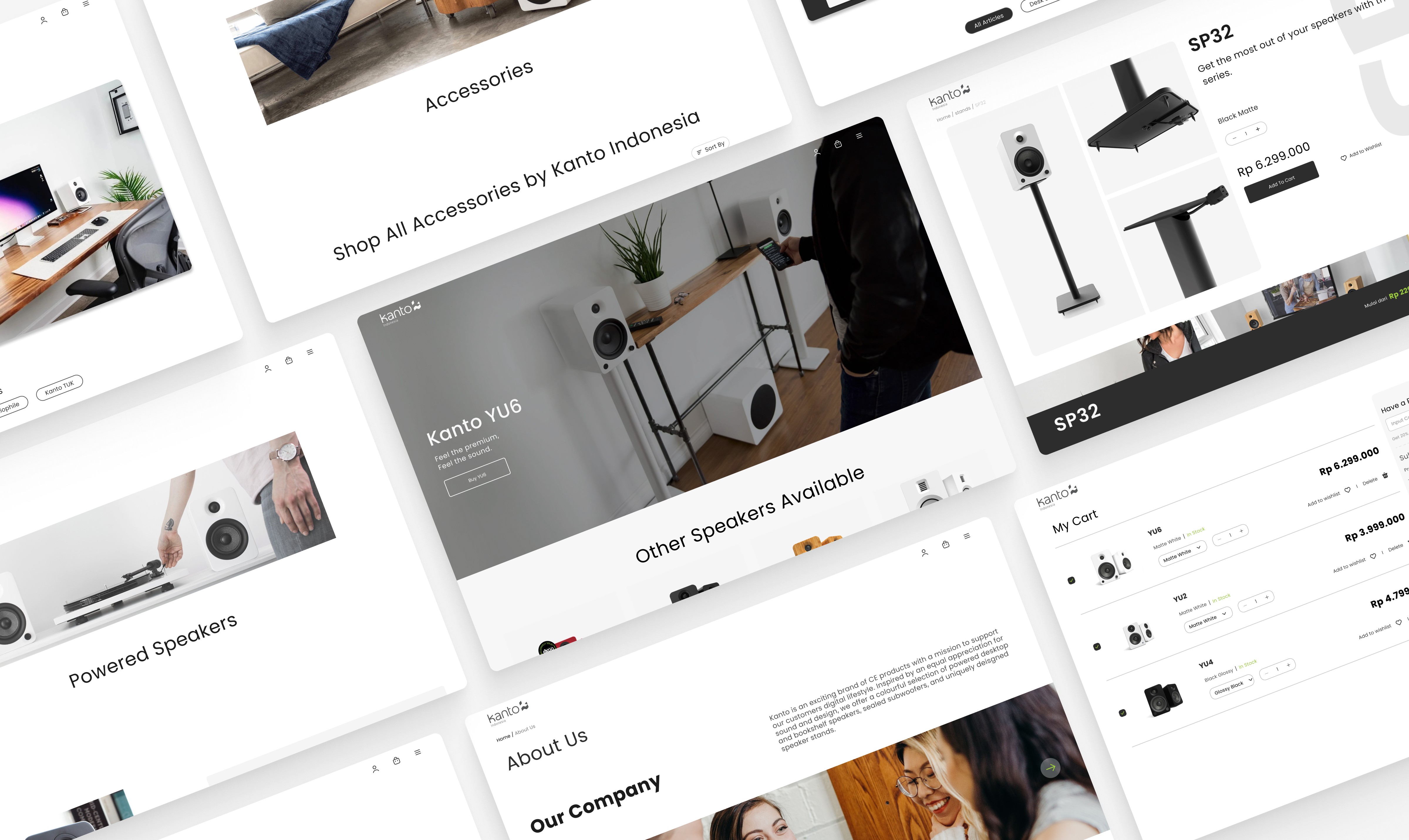


Kanto Indonesia - How I create bookshelf speakers E-commerce design.
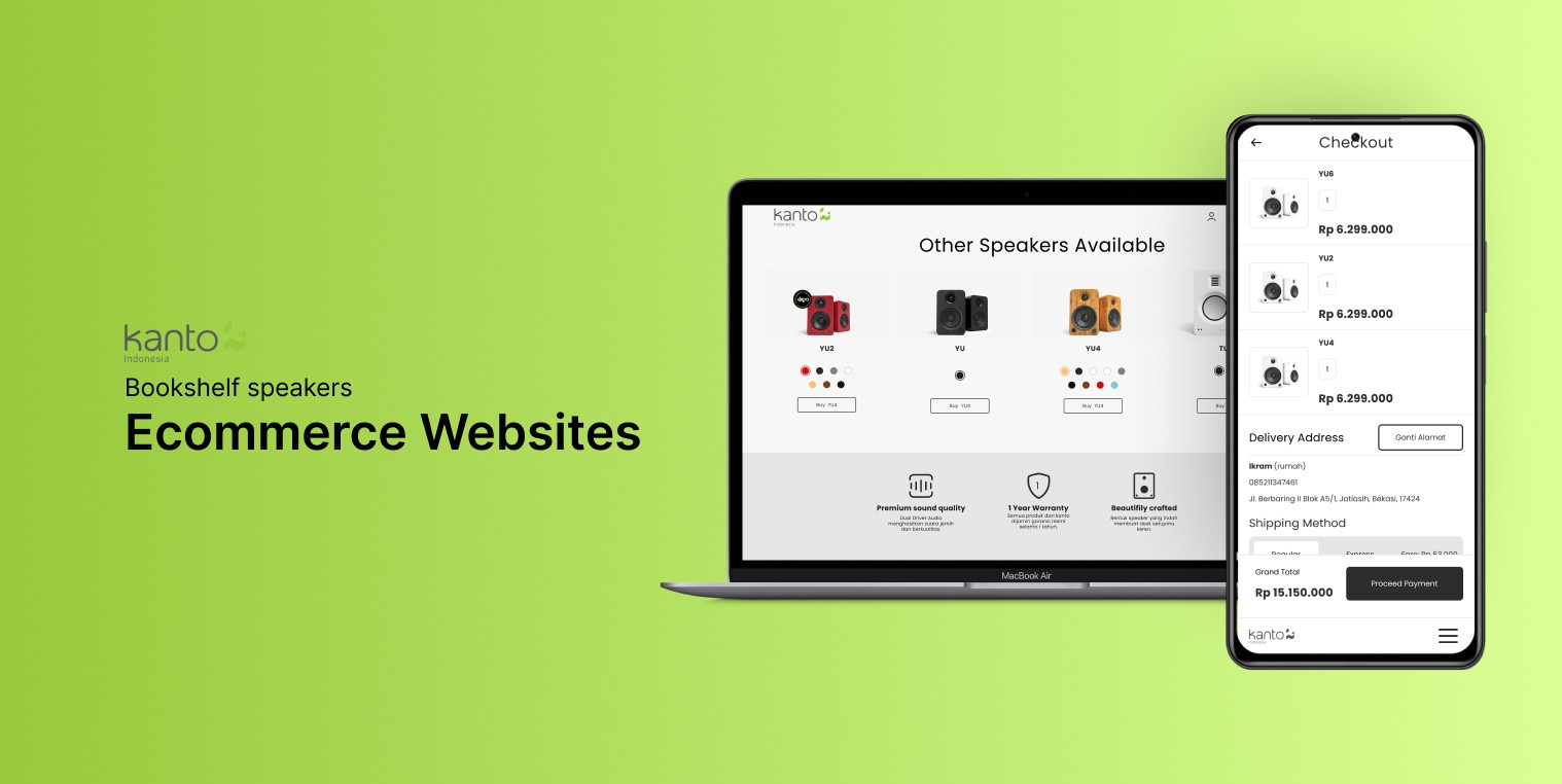
Kanto Indonesia - How I create bookshelf speakers E-commerce design.
Role:
UX/UI Designer
Duration:
Aug 2022 - Nov 2022 (3 months)
Responsibilities:
UX Research, UX Design, UI Design, Design Systems, Prototypes.
Expand and get closer to customers.
In 2022, Kanto Indonesia wanted to expand their market and have their own platform to sell its products. This aims to allow them to be closer to their customers. At the time Kanto Indonesia came to us, they only had existing e-commerce platform as their primary source of revenue. Without the ability to fully customize the look and feel, they decided to have their own websites.
My Role
I work at a small agency where I am the only UI/UX Designer. Therefore, my role is to start from conducting and synthesizing research results, creating wireframes, creating a design system, to transforming it into a high-fidelity design.
The Challenges
The project was completed through (mostly) an independent work.
This project was a big deal, and I was pretty much on my own with high hopes from the client. I didn't have much guidance except for occasional advice from the creative director and a project manager who wasn't around much. Despite all that, I made sure to keep things professional throughout the project.
Getting to know the audience and the world itself
I'll admit, I didn't know much about bookshelf speakers when I started this project. So, I had to dive into it headfirst, learning about something I had little knowledge of before. I did thorough research to understand what customers want in these products and how they typically buy them.
The approach
Focusing on, not goals, but behaviour
At the beginning, my goal was to create the design as complete as possible with my little knowledge from previous course i took and internet. The task was simple; create an e-commerce design selling only bookshelf speakers. At the time, i thought i’ve figured it out, we all know and already familiar with e-commerce & how things should work, right?
Well, that’s where i was wrong. My me as the only designer working in this project, i designed the homepage, the product catalog, the checkout proccess, all the way to profile section. I thought, ‘okay, that was it?’ no. there was no uniqueness whatsoever in that design, no deep understanding about the customer behaviour and needs. so, i conducted a research. The goal was to analyze what was the customer main concern on buying bookshelf speakers.
Gaining understanding from variety of users
The users on this research can be divided into 2 categories; the casual and the expert customer.
The casual, was the biggest segment in this category (~60%), people who are looking for speakers to put on their desk setup or TV table or bedroom.
The expert are those who are looking for tiny details about the speakers; the driver (of the speaker), the output, the input, etc.
I had to get into their mind, what was their concern, what was the questions in buying speakers.
The result
The need of guidance when choosing speakers
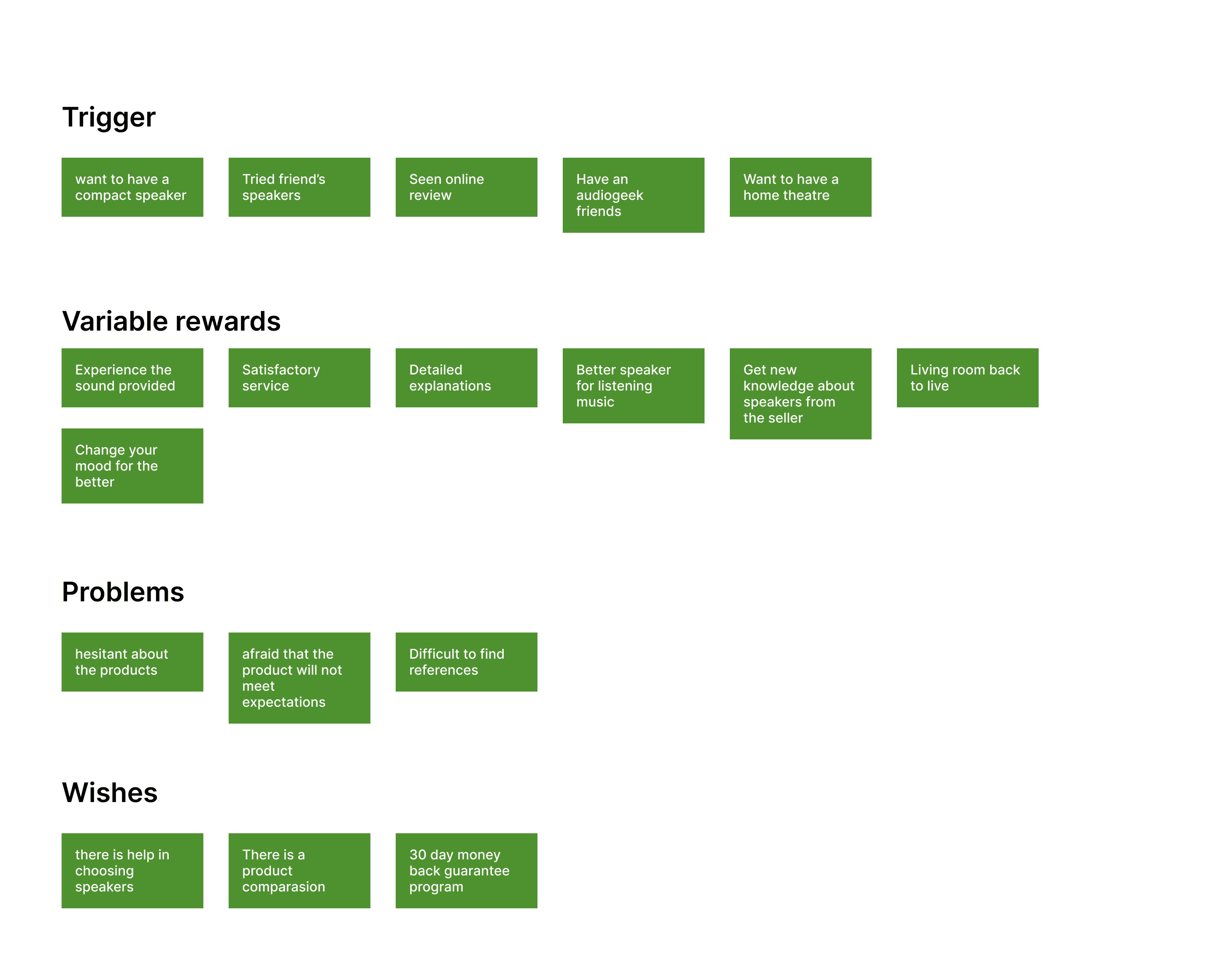
Simplified User mental model (2022)
I conducted user interviews with several users who met the research criteria, the results were that people felt doubtful and afraid that the product they purchased did not meet their expectations based on:
Product specifications
Online reviews
Usage requirements
Users also feel the need for help in choosing speakers, especially for those who are buying speakers for the first time or need speakers for a specific scenario (for example: listening to songs using a turntable) because the money spent for these needs is not small.
Research findings: Find your speakers
What i came up as a solution was to create a questionnaire' called “Find your speakers”. This questionnaire was served as an assistance to help users find the best speakers to suit their needs based on their answers. The questionnaire was based off users pain points & needs as well as suited with Kanto product specifications.
The illustrations would look like this:
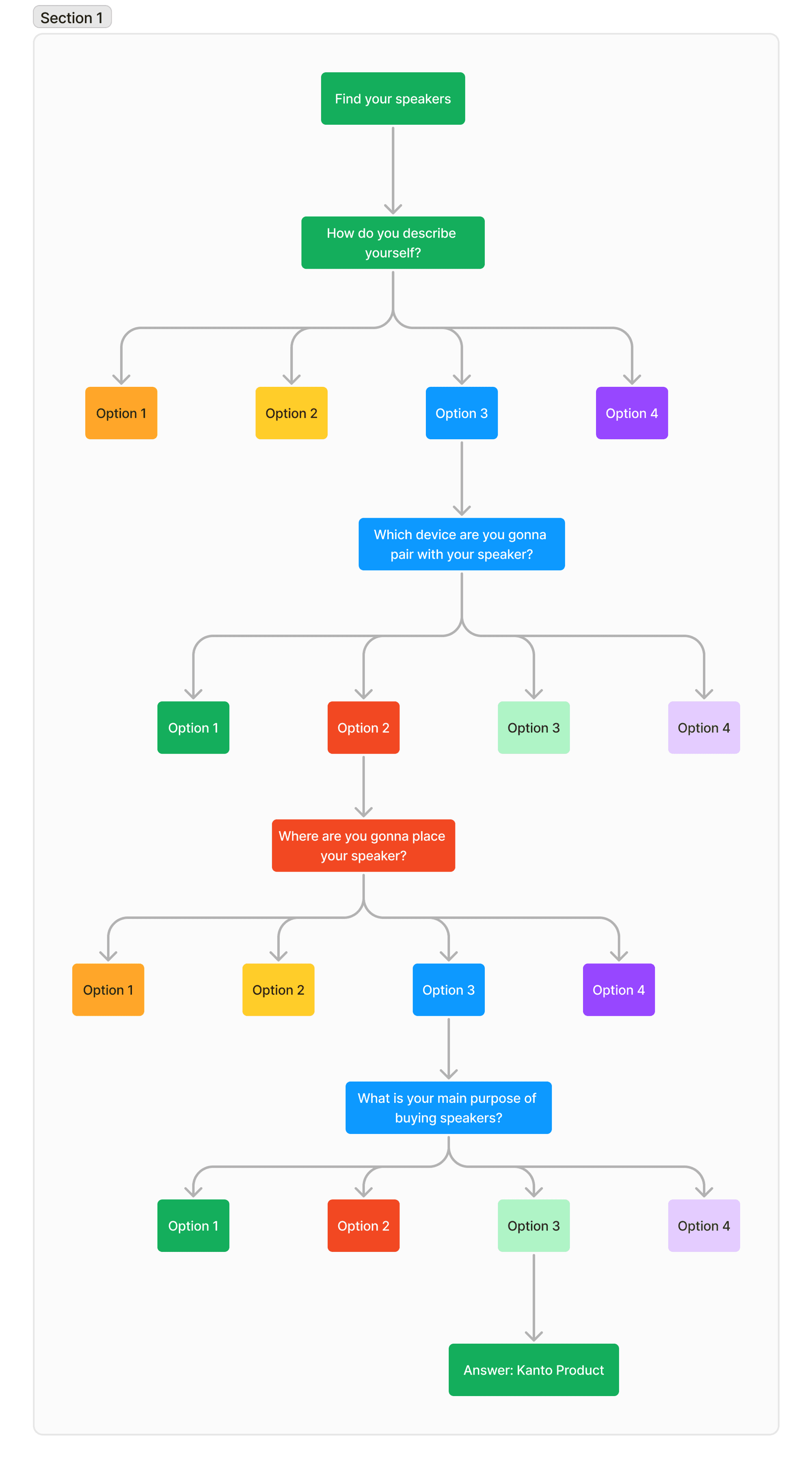
As you can see on the image above, we asked 4 different questions to user with 4 options. Each option will lead to different answer based on Kanto product specifications.
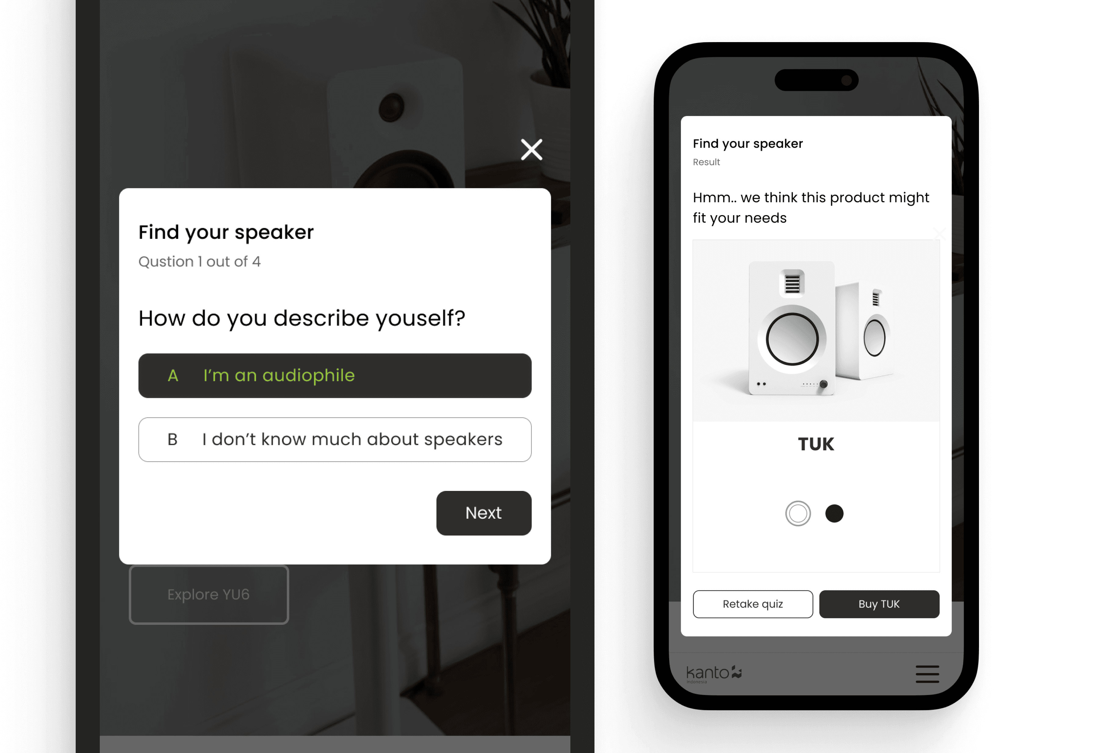
Find your speaker mobile view.
Alright.. that is all i can share to you about the research and stuff.. now let's get to visual aspect, shall we?
Color Pallete
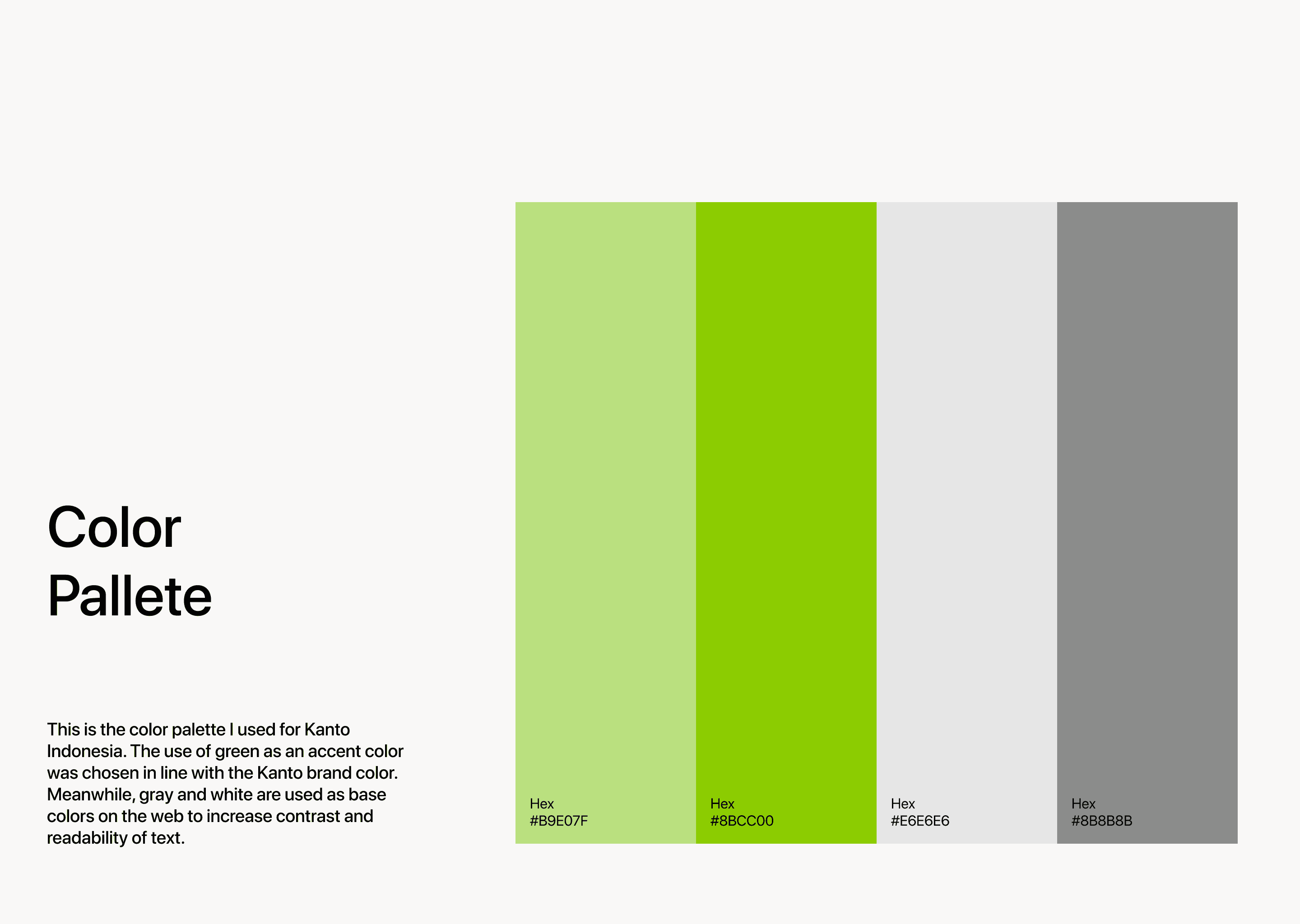
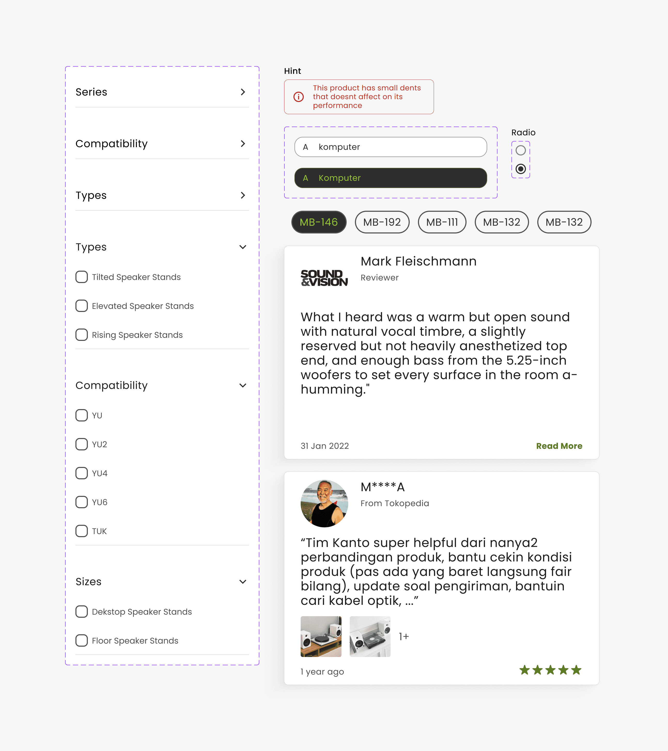
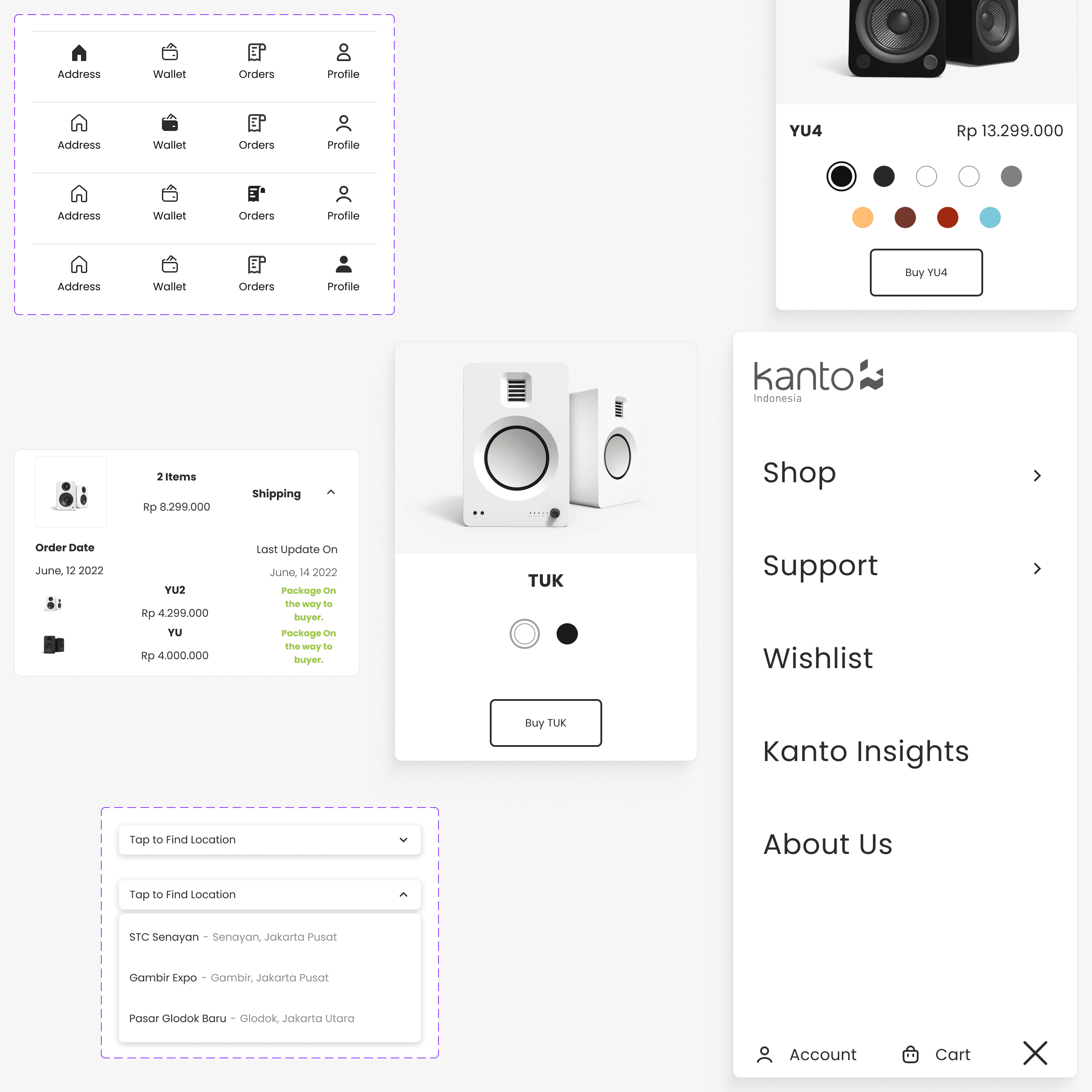
Design system
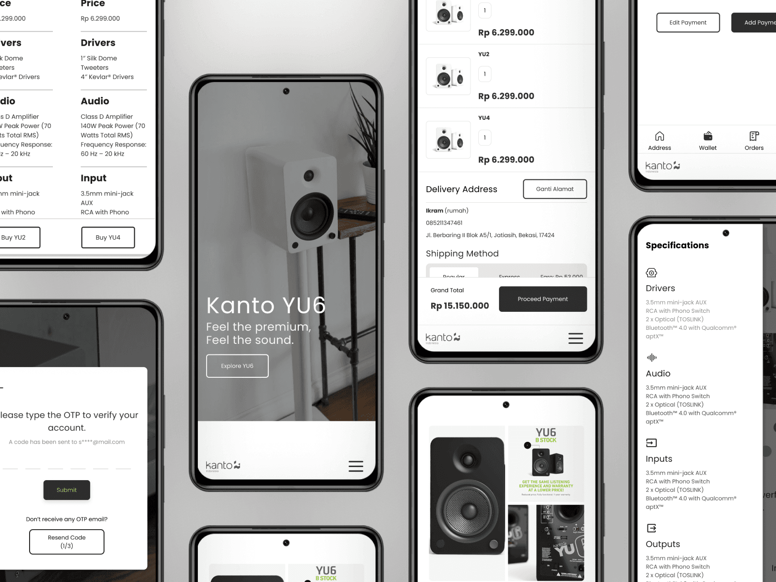
Screens - Mobile version
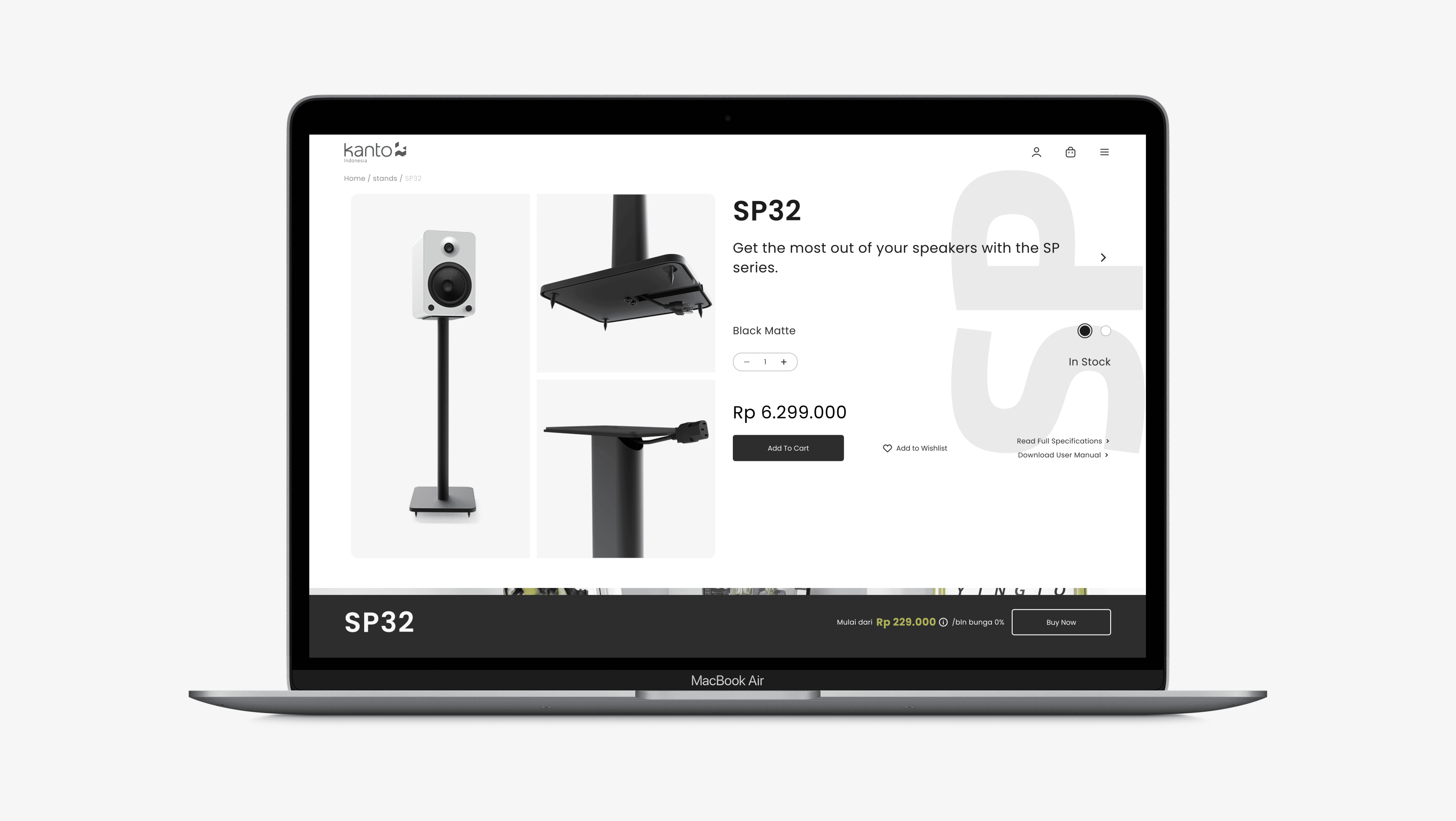
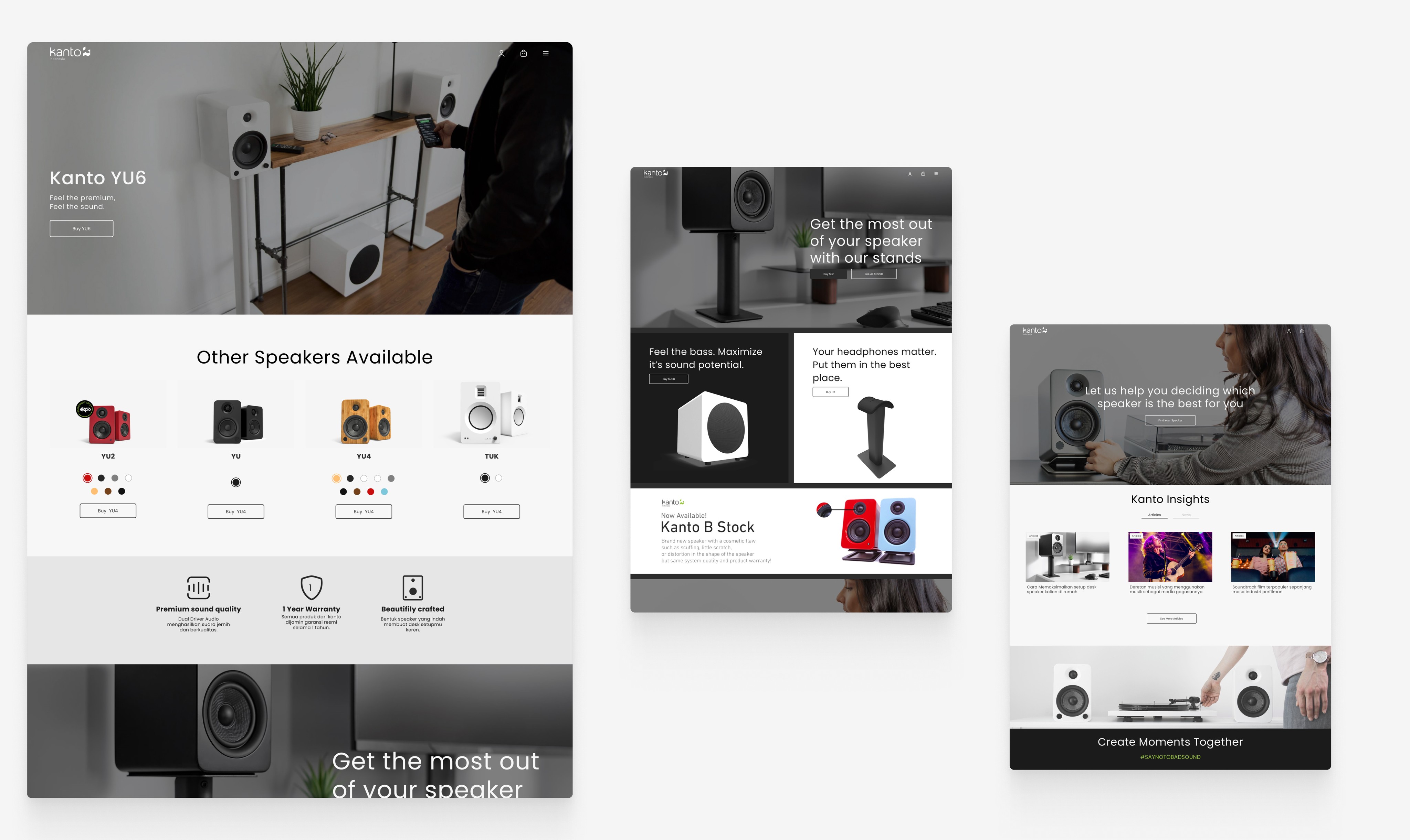
Screens - Desktop screen


Expand and get closer to customers.
In 2022, Kanto Indonesia wanted to expand their market and have their own platform to sell its products. This aims to allow them to be closer to their customers. At the time Kanto Indonesia came to us, they only had existing e-commerce platform as their primary source of revenue. Without the ability to fully customize the look and feel, they decided to have their own websites.
My Role
I work at a small agency where I am the only UI/UX Designer. Therefore, my role is to start from conducting and synthesizing research results, creating wireframes, creating a design system, to transforming it into a high-fidelity design.
The Challenges
The project was completed through (mostly) an independent work.
This project was a big deal, and I was pretty much on my own with high hopes from the client. I didn't have much guidance except for occasional advice from the creative director and a project manager who wasn't around much. Despite all that, I made sure to keep things professional throughout the project.
Getting to know the audience and the world itself
I'll admit, I didn't know much about bookshelf speakers when I started this project. So, I had to dive into it headfirst, learning about something I had little knowledge of before. I did thorough research to understand what customers want in these products and how they typically buy them.
The approach
Focusing on, not goals, but behaviour
At the beginning, my goal was to create the design as complete as possible with my little knowledge from previous course i took and internet. The task was simple; create an e-commerce design selling only bookshelf speakers. At the time, i thought i’ve figured it out, we all know and already familiar with e-commerce & how things should work, right?
Well, that’s where i was wrong. My me as the only designer working in this project, i designed the homepage, the product catalog, the checkout proccess, all the way to profile section. I thought, ‘okay, that was it?’ no. there was no uniqueness whatsoever in that design, no deep understanding about the customer behaviour and needs. so, i conducted a research. The goal was to analyze what was the customer main concern on buying bookshelf speakers.
Gaining understanding from variety of users
The users on this research can be divided into 2 categories; the casual and the expert customer.
The casual, was the biggest segment in this category (~60%), people who are looking for speakers to put on their desk setup or TV table or bedroom.
The expert are those who are looking for tiny details about the speakers; the driver (of the speaker), the output, the input, etc.
I had to get into their mind, what was their concern, what was the questions in buying speakers.
The result
The need of guidance when choosing speakers

Simplified User mental model (2022)
I conducted user interviews with several users who met the research criteria, the results were that people felt doubtful and afraid that the product they purchased did not meet their expectations based on:
Product specifications
Online reviews
Usage requirements
Users also feel the need for help in choosing speakers, especially for those who are buying speakers for the first time or need speakers for a specific scenario (for example: listening to songs using a turntable) because the money spent for these needs is not small.
Research findings: Find your speakers
What i came up as a solution was to create a questionnaire' called “Find your speakers”. This questionnaire was served as an assistance to help users find the best speakers to suit their needs based on their answers. The questionnaire was based off users pain points & needs as well as suited with Kanto product specifications.
The illustrations would look like this:

As you can see on the image above, we asked 4 different questions to user with 4 options. Each option will lead to different answer based on Kanto product specifications.

Find your speaker mobile view.
Alright.. that is all i can share to you about the research and stuff.. now let's get to visual aspect, shall we?
Color Pallete

Design system


Screens - Mobile version

Screens - Desktop screen


Expand and get closer to customers.
In 2022, Kanto Indonesia wanted to expand their market and have their own platform to sell its products. This aims to allow them to be closer to their customers. At the time Kanto Indonesia came to us, they only had existing e-commerce platform as their primary source of revenue. Without the ability to fully customize the look and feel, they decided to have their own websites.
My Role
I work at a small agency where I am the only UI/UX Designer. Therefore, my role is to start from conducting and synthesizing research results, creating wireframes, creating a design system, to transforming it into a high-fidelity design.
The Challenges
The project was completed through (mostly) an independent work.
This project was a big deal, and I was pretty much on my own with high hopes from the client. I didn't have much guidance except for occasional advice from the creative director and a project manager who wasn't around much. Despite all that, I made sure to keep things professional throughout the project.
Getting to know the audience and the world itself
I'll admit, I didn't know much about bookshelf speakers when I started this project. So, I had to dive into it headfirst, learning about something I had little knowledge of before. I did thorough research to understand what customers want in these products and how they typically buy them.
The approach
Focusing on, not goals, but behaviour
At the beginning, my goal was to create the design as complete as possible with my little knowledge from previous course i took and internet. The task was simple; create an e-commerce design selling only bookshelf speakers. At the time, i thought i’ve figured it out, we all know and already familiar with e-commerce & how things should work, right?
Well, that’s where i was wrong. My me as the only designer working in this project, i designed the homepage, the product catalog, the checkout proccess, all the way to profile section. I thought, ‘okay, that was it?’ no. there was no uniqueness whatsoever in that design, no deep understanding about the customer behaviour and needs. so, i conducted a research. The goal was to analyze what was the customer main concern on buying bookshelf speakers.
Gaining understanding from variety of users
The users on this research can be divided into 2 categories; the casual and the expert customer.
The casual, was the biggest segment in this category (~60%), people who are looking for speakers to put on their desk setup or TV table or bedroom.
The expert are those who are looking for tiny details about the speakers; the driver (of the speaker), the output, the input, etc.
I had to get into their mind, what was their concern, what was the questions in buying speakers.
The result
The need of guidance when choosing speakers

Simplified User mental model (2022)
I conducted user interviews with several users who met the research criteria, the results were that people felt doubtful and afraid that the product they purchased did not meet their expectations based on:
Product specifications
Online reviews
Usage requirements
Users also feel the need for help in choosing speakers, especially for those who are buying speakers for the first time or need speakers for a specific scenario (for example: listening to songs using a turntable) because the money spent for these needs is not small.
Research findings: Find your speakers
What i came up as a solution was to create a questionnaire' called “Find your speakers”. This questionnaire was served as an assistance to help users find the best speakers to suit their needs based on their answers. The questionnaire was based off users pain points & needs as well as suited with Kanto product specifications.
The illustrations would look like this:

As you can see on the image above, we asked 4 different questions to user with 4 options. Each option will lead to different answer based on Kanto product specifications.

Find your speaker mobile view.
Alright.. that is all i can share to you about the research and stuff.. now let's get to visual aspect, shall we?
Color Pallete

Design system


Screens - Mobile version

Screens - Desktop screen


Expand and get closer to customers.
In 2022, Kanto Indonesia wanted to expand their market and have their own platform to sell its products. This aims to allow them to be closer to their customers. At the time Kanto Indonesia came to us, they only had existing e-commerce platform as their primary source of revenue. Without the ability to fully customize the look and feel, they decided to have their own websites.
My Role
I work at a small agency where I am the only UI/UX Designer. Therefore, my role is to start from conducting and synthesizing research results, creating wireframes, creating a design system, to transforming it into a high-fidelity design.
The Challenges
The project was completed through (mostly) an independent work.
This project was a big deal, and I was pretty much on my own with high hopes from the client. I didn't have much guidance except for occasional advice from the creative director and a project manager who wasn't around much. Despite all that, I made sure to keep things professional throughout the project.
Getting to know the audience and the world itself
I'll admit, I didn't know much about bookshelf speakers when I started this project. So, I had to dive into it headfirst, learning about something I had little knowledge of before. I did thorough research to understand what customers want in these products and how they typically buy them.
The approach
Focusing on, not goals, but behaviour
At the beginning, my goal was to create the design as complete as possible with my little knowledge from previous course i took and internet. The task was simple; create an e-commerce design selling only bookshelf speakers. At the time, i thought i’ve figured it out, we all know and already familiar with e-commerce & how things should work, right?
Well, that’s where i was wrong. My me as the only designer working in this project, i designed the homepage, the product catalog, the checkout proccess, all the way to profile section. I thought, ‘okay, that was it?’ no. there was no uniqueness whatsoever in that design, no deep understanding about the customer behaviour and needs. so, i conducted a research. The goal was to analyze what was the customer main concern on buying bookshelf speakers.
Gaining understanding from variety of users
The users on this research can be divided into 2 categories; the casual and the expert customer.
The casual, was the biggest segment in this category (~60%), people who are looking for speakers to put on their desk setup or TV table or bedroom.
The expert are those who are looking for tiny details about the speakers; the driver (of the speaker), the output, the input, etc.
I had to get into their mind, what was their concern, what was the questions in buying speakers.
The result
The need of guidance when choosing speakers

Simplified User mental model (2022)
I conducted user interviews with several users who met the research criteria, the results were that people felt doubtful and afraid that the product they purchased did not meet their expectations based on:
Product specifications
Online reviews
Usage requirements
Users also feel the need for help in choosing speakers, especially for those who are buying speakers for the first time or need speakers for a specific scenario (for example: listening to songs using a turntable) because the money spent for these needs is not small.
Research findings: Find your speakers
What i came up as a solution was to create a questionnaire' called “Find your speakers”. This questionnaire was served as an assistance to help users find the best speakers to suit their needs based on their answers. The questionnaire was based off users pain points & needs as well as suited with Kanto product specifications.
The illustrations would look like this:

As you can see on the image above, we asked 4 different questions to user with 4 options. Each option will lead to different answer based on Kanto product specifications.

Find your speaker mobile view.
Alright.. that is all i can share to you about the research and stuff.. now let's get to visual aspect, shall we?
Color Pallete

Design system


Screens - Mobile version

Screens - Desktop screen
